Brooklyn Low Voltage Supply
WordPress to BigCommerce migration & redesign · Launched July 2025
- My Role
- Project lead & design direction: discovery, competitive research, prototypes for every template, client design reviews, documentation, and training
- Team
- Me (project lead), a designer, and the agency's lead developer
- Timeline & Status
- Kicked off July 2024. Launched July 2025.
Overview
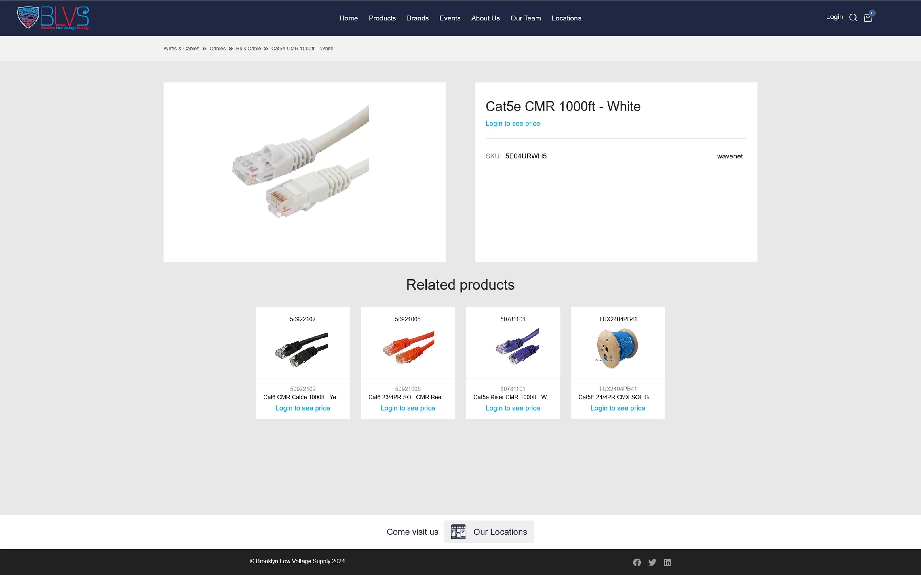
Brooklyn Low Voltage Supply sells security and low-voltage equipment to contractors and integrators. Their old site gave buyers almost nothing: a product name, a SKU, and "Login to see price."
I led discovery, studied the stores contractors already shop, and set the design direction for the entire site, prototyping every template from the homepage to the product page. The result is a modern, spec-rich store that answers buyer questions before they're asked.
02 Highlights
A store that looks as serious as the business.
The new homepage puts the full catalog one click away, rotates featured products, and tells buyers why BLVS (competitive pricing, local delivery, real support) before they scroll.
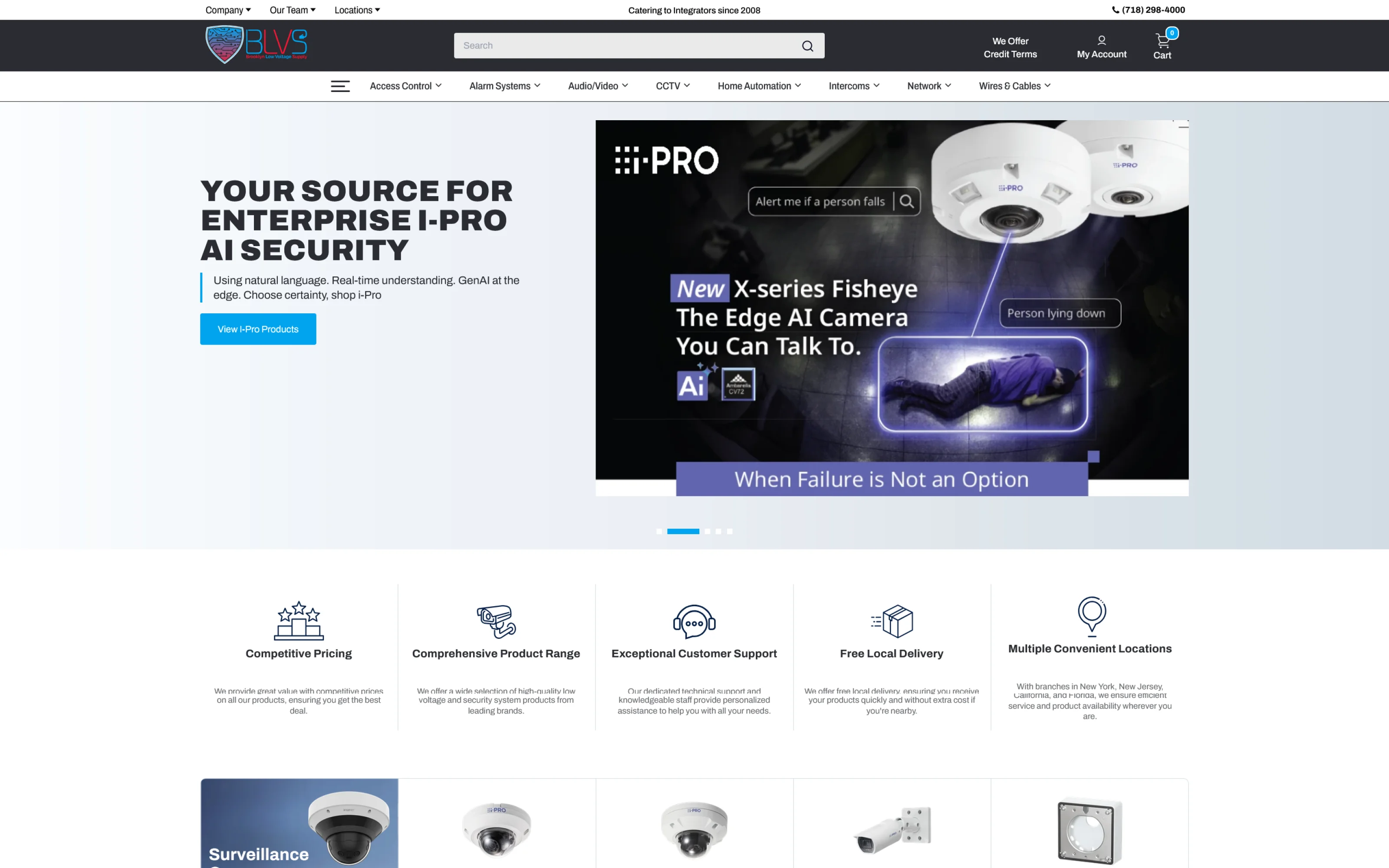
- 1Category navigationEvery major product category, always visible
- 2Rotating heroFeatured products and brands
- 3Trust barThe reasons to buy from BLVS, up front
03 The Problem
A name, a price, and nothing else.
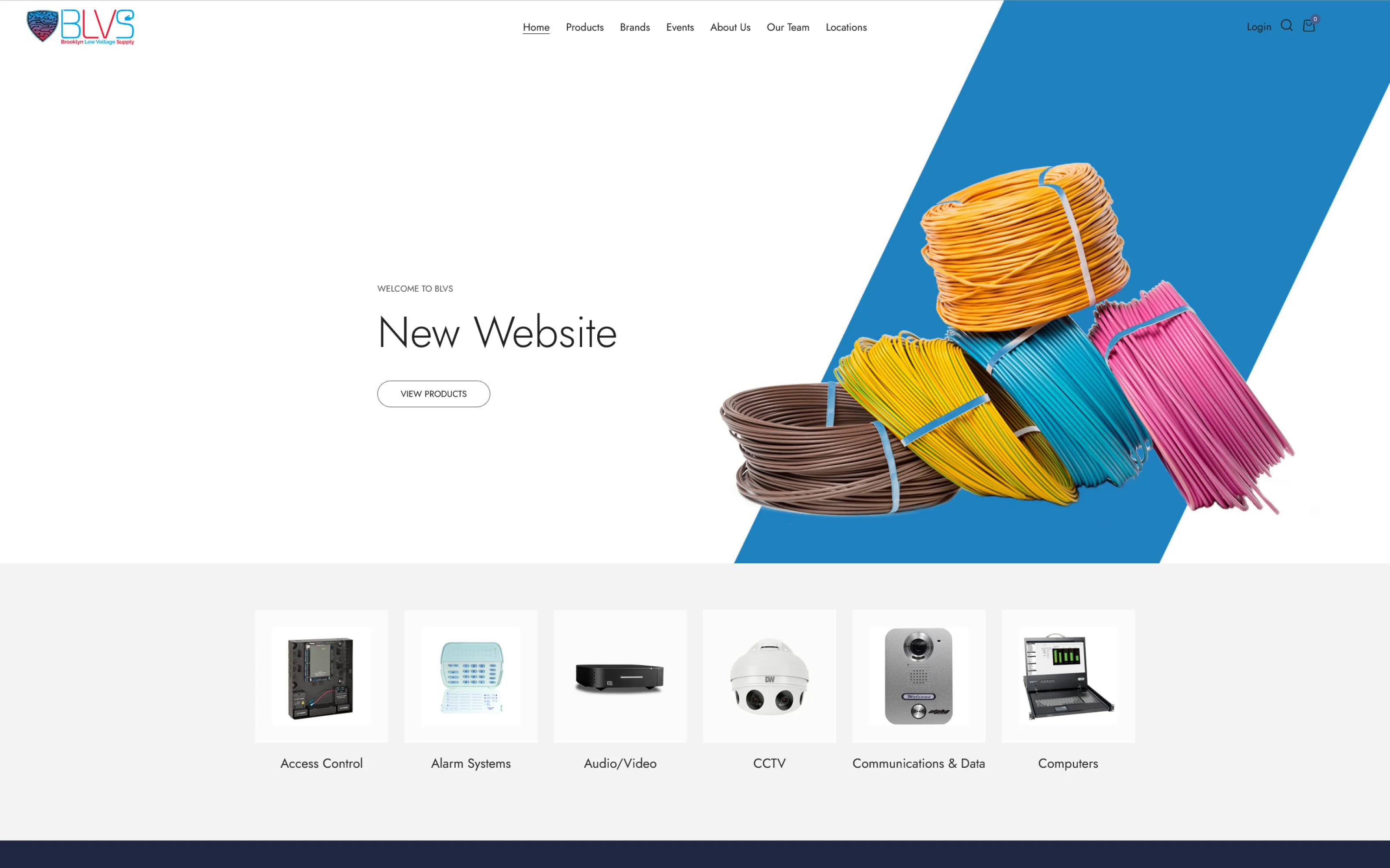
Product pages had little more than a name and a SKU, and visitors had to create an account just to see pricing. The site barely explained who BLVS was. For contractors, that's a dealbreaker: they need detailed specs to make sure a part works with their project, because the wrong order means delays and returns.
04 Discovery
Shopping their competitors like a contractor would.
In discovery calls, the BLVS team was upfront: they knew their site wasn't on par with their competitors, and blank product pages helped no one, least of all the contractors they sell to. I audited what their site had and what it was missing.
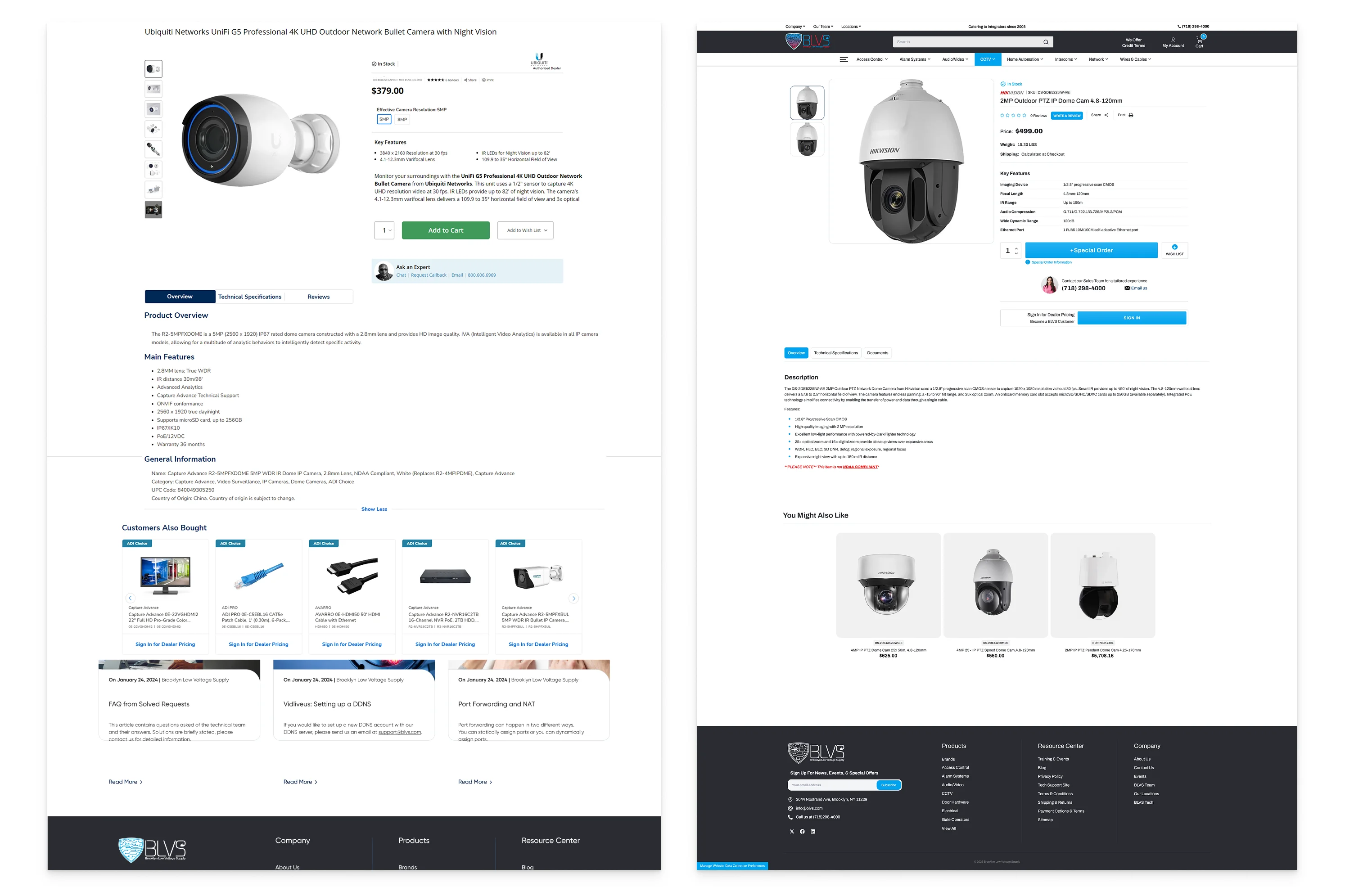
Then I shopped the stores their buyers already know, like B&H Photo, Best Buy, and RadioShack, the way a buyer would, and noted every feature that actually helped, like a key features table above Add to Cart and a dedicated technical specifications tab. My filter: keep anything that helped a buyer decide, as long as it didn't need heavy custom development.
Familiar was the point. Contractors already know how to shop those stores, so patterns they recognize mean nothing new to learn when they're ordering parts for a job.
05 Design Direction
Every template, from the first prototype.
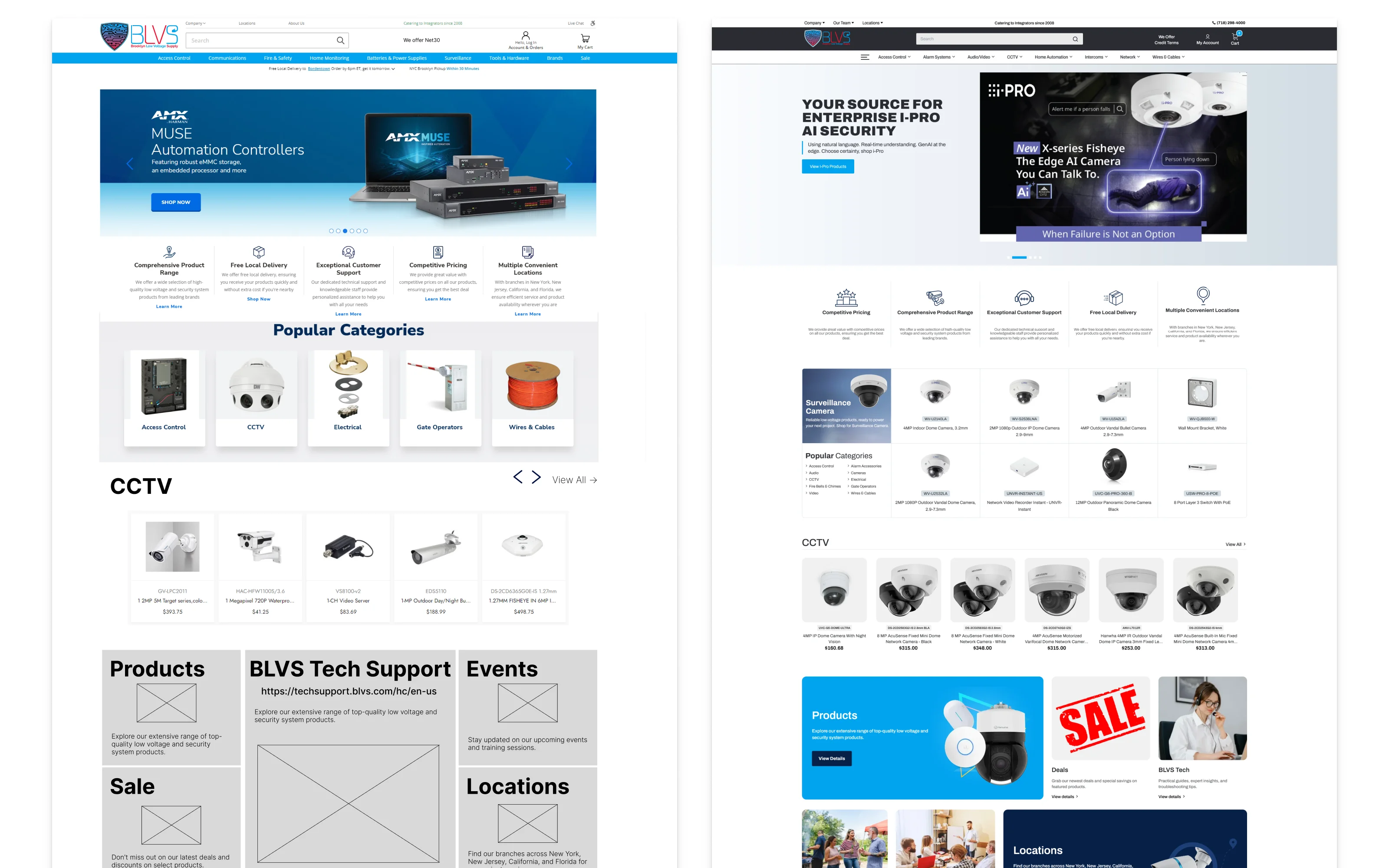
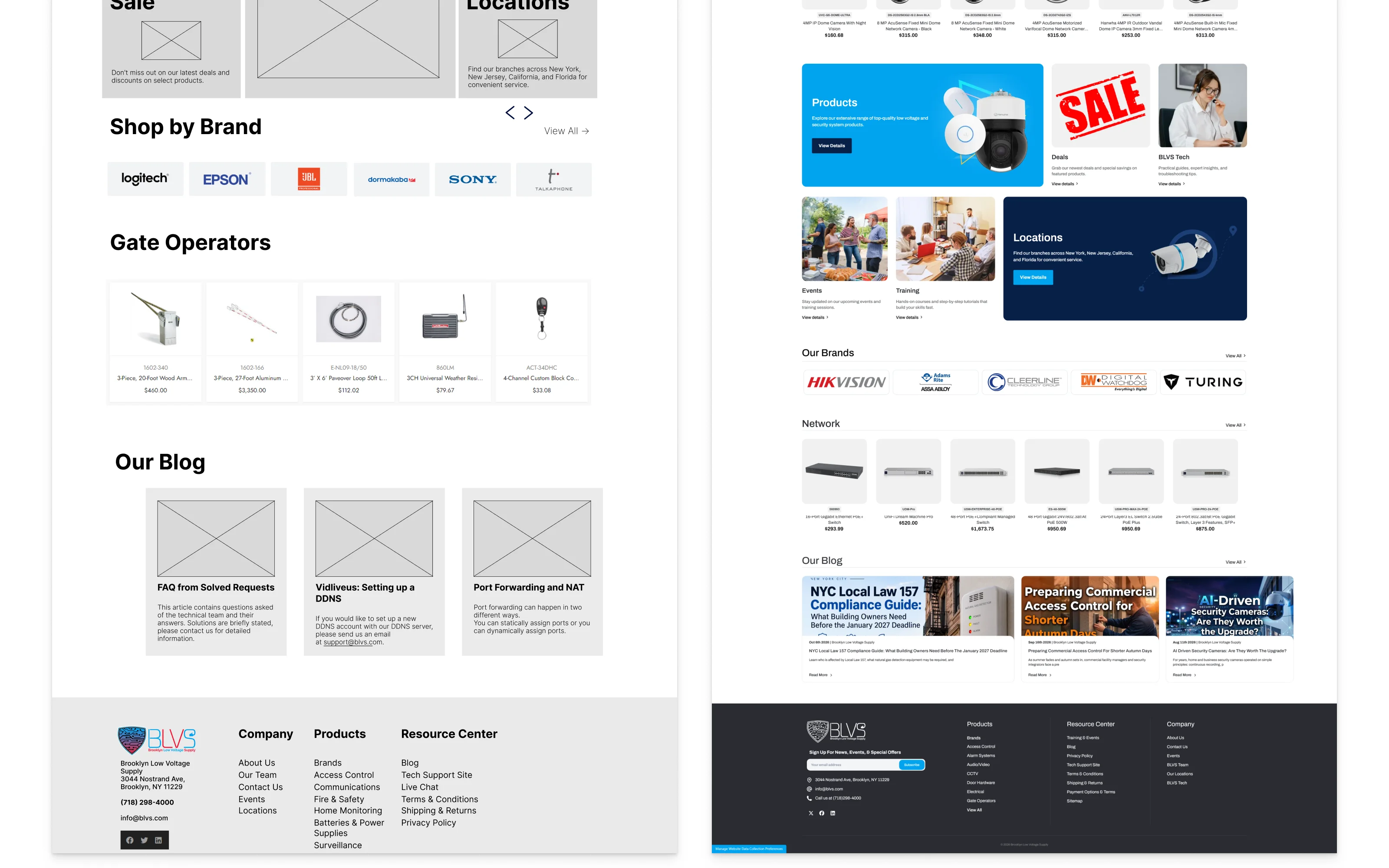
I owned the design direction for the full site: home, category, and product pages, the header and footer, the mega menu, and the side navigation. I made the layout and UX calls, prototyped every template, then refined them into final designs with our designer through review rounds with the client.
The first homepage drafts went out nine days after kickoff: four designs across two styles and four colorways. Once the homepage direction was set, ten category and product page designs followed.
06 Review Process
Feedback dates, price tags, and a sign-off gate.
Every new round of designs went into Figma with a Basecamp post announcing it and a date for feedback. I also added an official checklist for moving from design into development, so nothing got built until the client signed off on the designs.
When the BLVS team asked for extras mid-design, like a dark mode and a sticky header on the product page, I put the sticky header design in Figma and came back with a cost estimate for each. That let them decide what was worth adding, instead of the scope quietly growing: the sticky header went live with the site, and dark mode was dropped.
07 Key Decisions
7AA product page built around specs.
Contractors buy on compatibility, so the product page had to answer technical questions before they were asked. Our research showed the strongest spec-driven stores share three things, and the page brings all three together: key features above Add to Cart, full specs in their own tab, and an expert contact right next to the buy button.
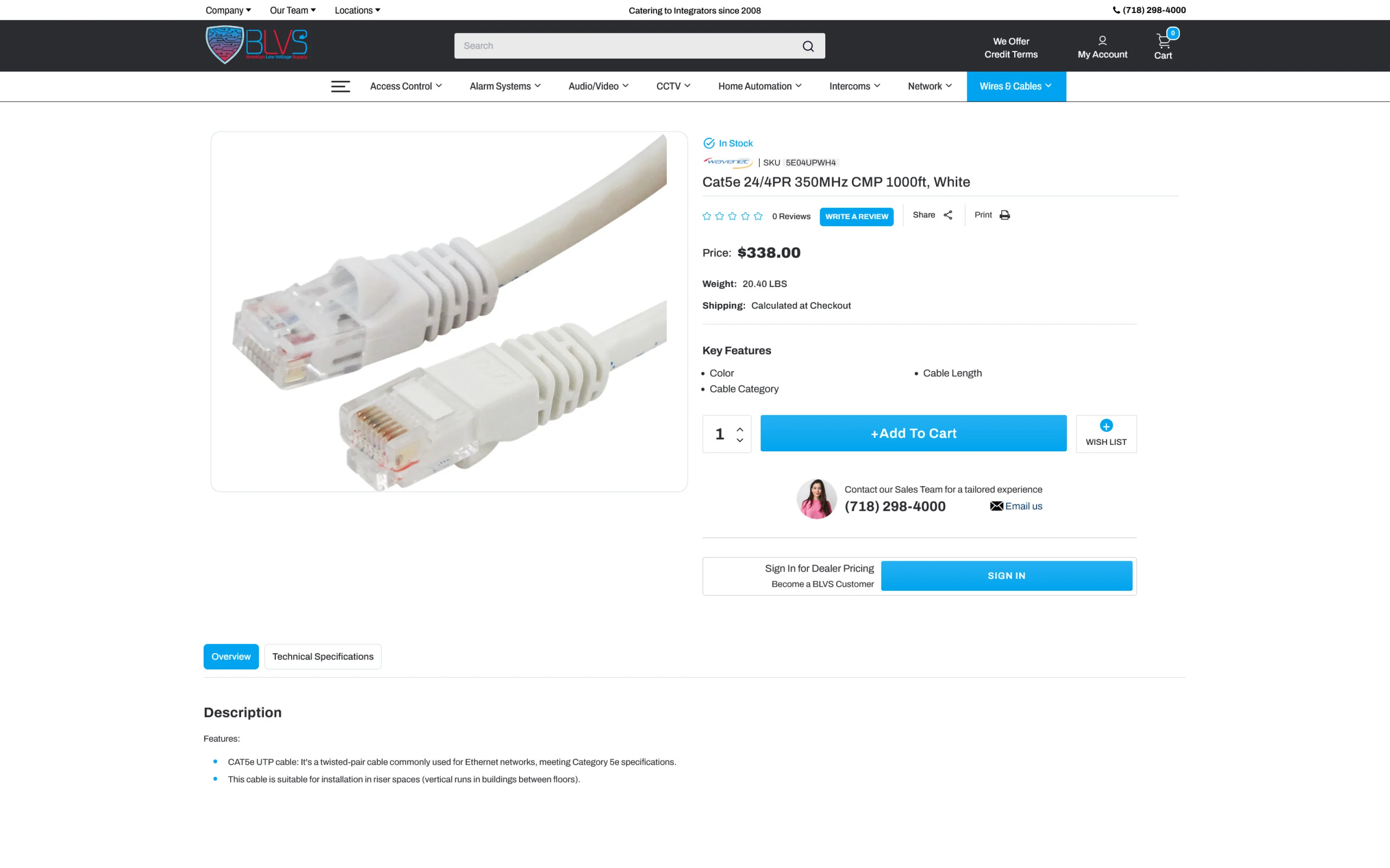
- 1Price & stockVisible to everyone, no login required
- 2Key featuresThe specs that matter, above the buy button
- 3Contact Our Sales TeamA direct line to an expert
- 4Dealer sign-inBetter pricing for registered customers
- 5Overview & Tech Specs tabsFull details, one click away
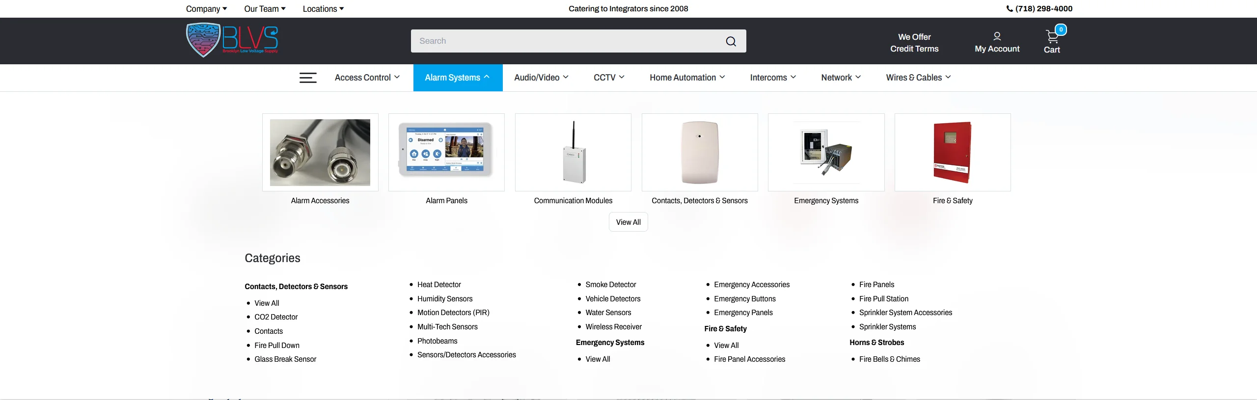
7BScan by picture, or go straight to the list.
BLVS carries a large catalog across access control, alarm systems, CCTV, networking, and more. I chose a visual mega menu, a pattern buyers already know from the big electronics retailers: images for the main subcategories so buyers can scan at a glance, with the full category list underneath for people who know exactly what they need.
7CReuse what already works.
The product page needed an easy way to reach a real person. Instead of designing something new, I proposed reusing a "Contact Our Sales Team" widget from a previous project, giving buyers a direct line to an expert without new development. You can see it in Figure 4.1.
08 Handoff
Built for their team to run.
Before launch I wrote the client documentation and trained the BLVS team on managing the store, including the custom fields behind the product pages.
Each custom field is a simple name and value. A few special codes handle stock tracking and product datasheets, and everything else shows up automatically as a specification on the product page. So adding a spec is as simple as adding a field.
For the move from WordPress, I set up the 301 redirects: I scanned the old site's URLs with SEMrush and pointed each one to its new BigCommerce page, so old links and bookmarks still land somewhere useful.
09 Outcome
A store that answers questions up front.
BLVS now has a modern, spec-rich store: transparent pricing, faster product discovery through the mega menu and category navigation, and B2B features like Net 30 accounts. It's built so buyers can find what they need without having to call first.
| Before | After | |
|---|---|---|
| Pricing | Create an account to see any price | Price and stock visible to everyone; dealer pricing with sign-in |
| Product pages | A name and a SKU | Key features above the buy button, full specs in their own tab |
| Homepage | A hero that read "New Website" | Rotating featured products and brands |
| Why buy from BLVS | Barely explained | A trust bar up front: pricing, delivery, support |