- My Role
- Project lead & client liaison: page requirements, customer journey, wireframes, client design reviews, documentation, and training
- Team
- Me (project lead), a designer, and the agency's lead developer
- Timeline & Status
- 4.5 months. Launched March 2025. One of my first projects as project lead.
Overview
Therapeutic Training Center sells continuing-education classes to massage therapists across the Pacific Northwest. Its owner, Robbin, runs the whole business herself, website included. Every time she added a class, she had to build its web page by hand, which took hours per class. And anyone visiting on a phone got the full desktop site squeezed onto a small screen, because the mobile layout had been turned off.
I led the redesign with Robbin, from page requirements and wireframes through design reviews, launch, and training. Today, class updates take a few minutes of filling in fields, and she handles the site day to day herself.
02 Highlights
A site built around how students find classes.
The redesigned homepage leads with what students come for: classes they can browse by location, type, certification, or instructor, in a look that feels rooted in the Pacific Northwest.
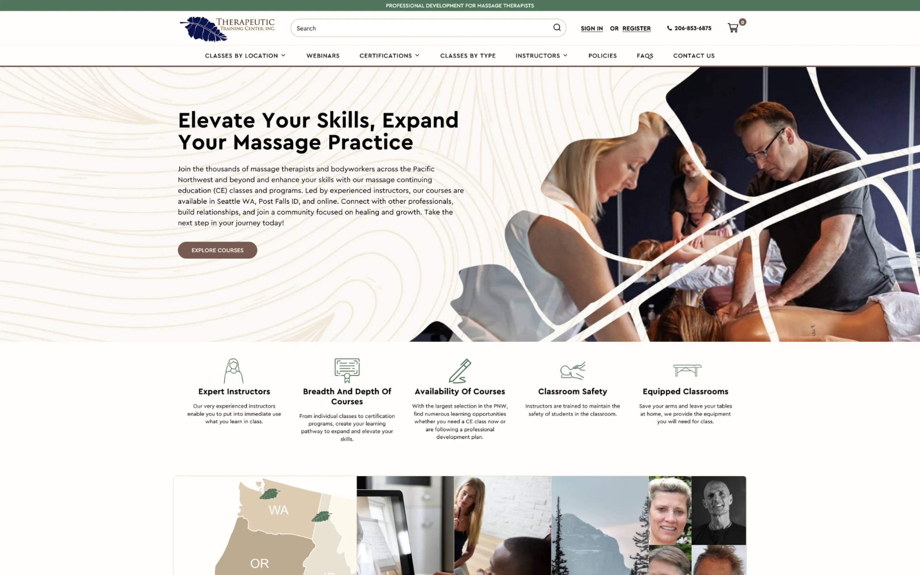
- 1Browse four waysClasses by location, type, certification, or instructor
- 2Explore CoursesOne clear next step from the hero
- 3Topographic line patternThe Pacific Northwest design element used across the site
03 The Problem
Every new class meant hours of code.
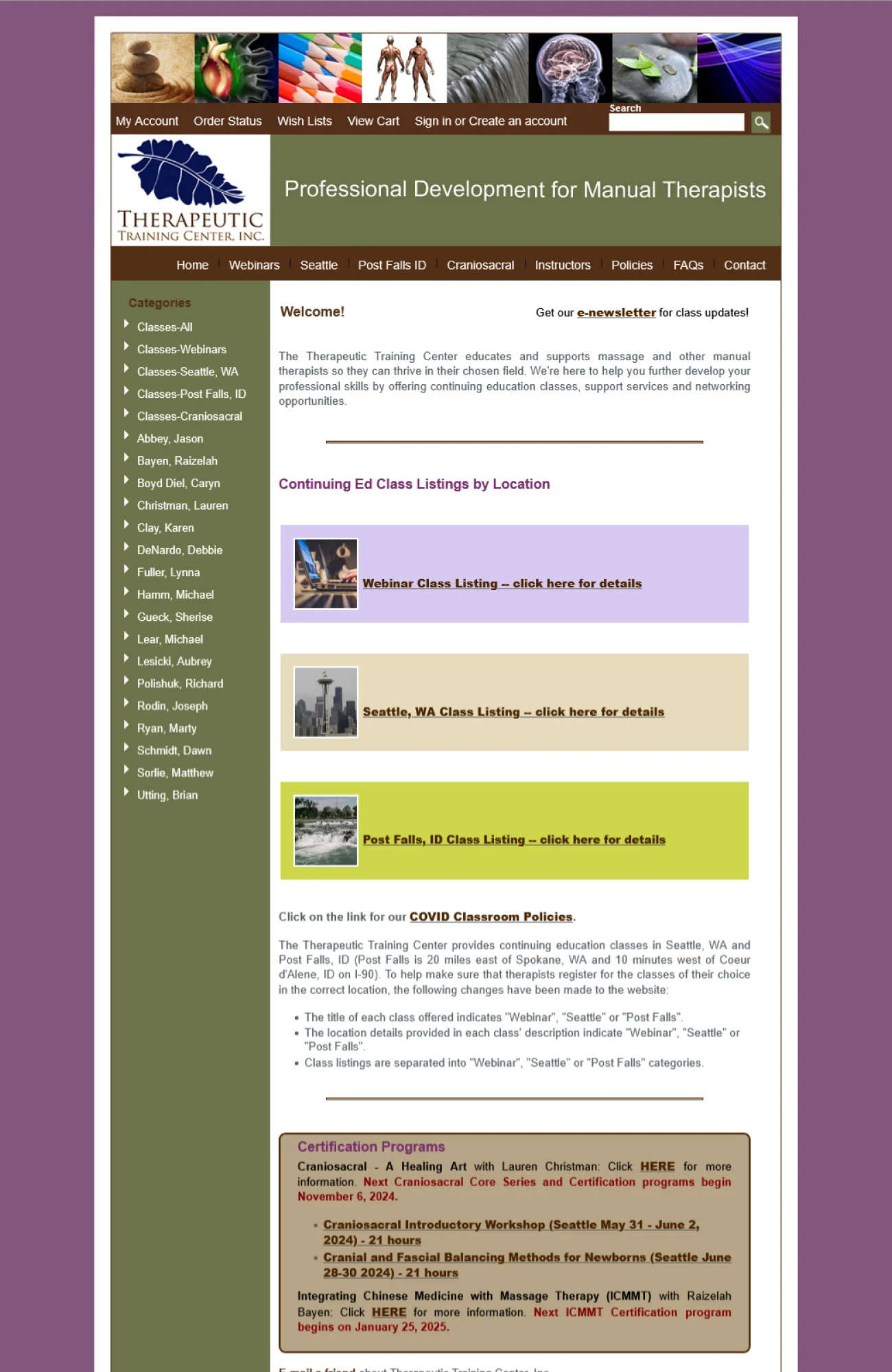
Each new class meant writing its page in HTML by hand, then copying the same details (instructor, dates, CE hours, price) onto the location schedule and the instructor's page, and checking every page for broken links and mistakes. That was roughly 2–3 hours per class. Adding ten classes to the schedule could take a full day or more, and her schedule today lists about 25 upcoming classes, not counting certification programs.
On top of that, the mobile layout was so broken it had been turned off for more than a year, so phone visitors saw the desktop site shrunk to fit their screen, even though more than half of purchases happened on phones. From November 2022 to March 2024, organic search traffic sat near zero.
04 The Challenge
Two users: the students, and Robbin.
Students aren't grabbing a product off a shelf. They're choosing a teacher and committing to a course, sometimes one that runs multiple weeks. Before they buy, they need to know who's teaching, what happens in class, where it is, and how it counts toward certification. The site had to carry all of that without burying it.
And the site had a second user: Robbin herself, who would be adding and updating classes with no developer on staff. A site that looked great to students but was hard for her to run would only have solved half the problem.
05 Page Structure
Eight page types, one customer journey.
I worked through each type of page with Robbin to decide what it needed to say. That became eight custom page templates. Then I shaped the navigation around how students actually look for classes: by location, instructor, or class type.
- HomeBrowse classes by location, type, certification, or instructor
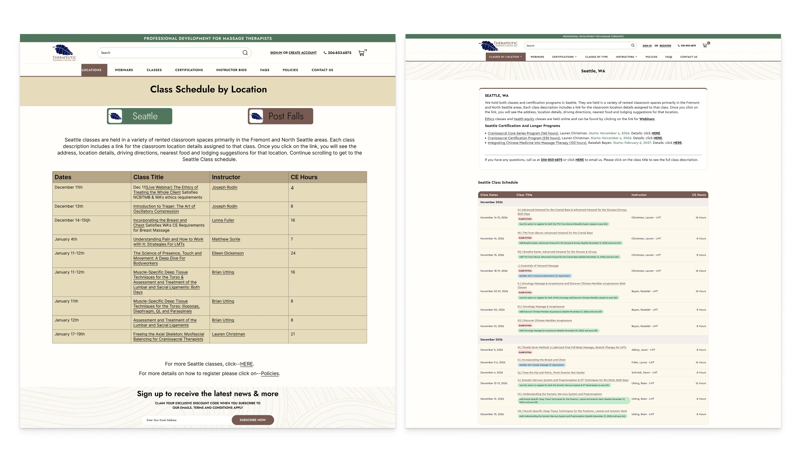
- Classes by locationEach location's schedule in the date-ordered class table (Figure 3.0)
- Class pageDescription, instructor, logistics, price, and info pop-ups (Figure 4.0)
- InstructorOne instructor's bio and a table of their upcoming classes
- All instructorsEvery instructor's bio and class table on one page
- Certification programOne template shared by each multi-class program
- Location infoParking, food, directions, and lodging for each location
- FAQsCommon questions, answered in one place
06 Wireframes
Built around what a student needs before buying.
For each template I built a rough wireframe as direction for our designer, then ran review rounds in Figma with Robbin until each layout was approved. The class page puts the description, instructor, logistics, and price up front.
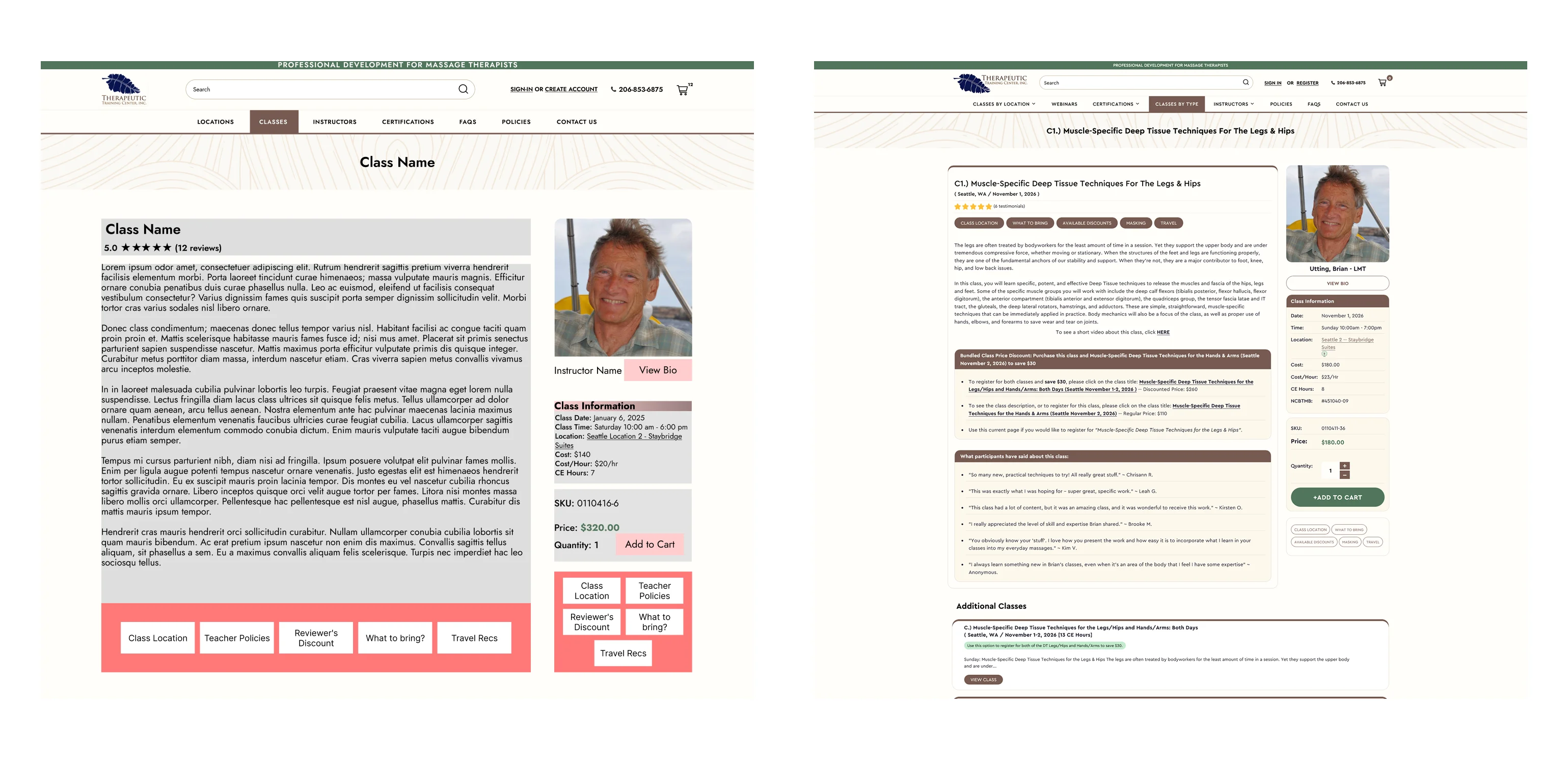
- 1Class descriptionWhat happens in class, front and center
- 2InstructorPhoto and bio link, because students choose the teacher
- 3Class informationDate, time, location, cost, CE hours
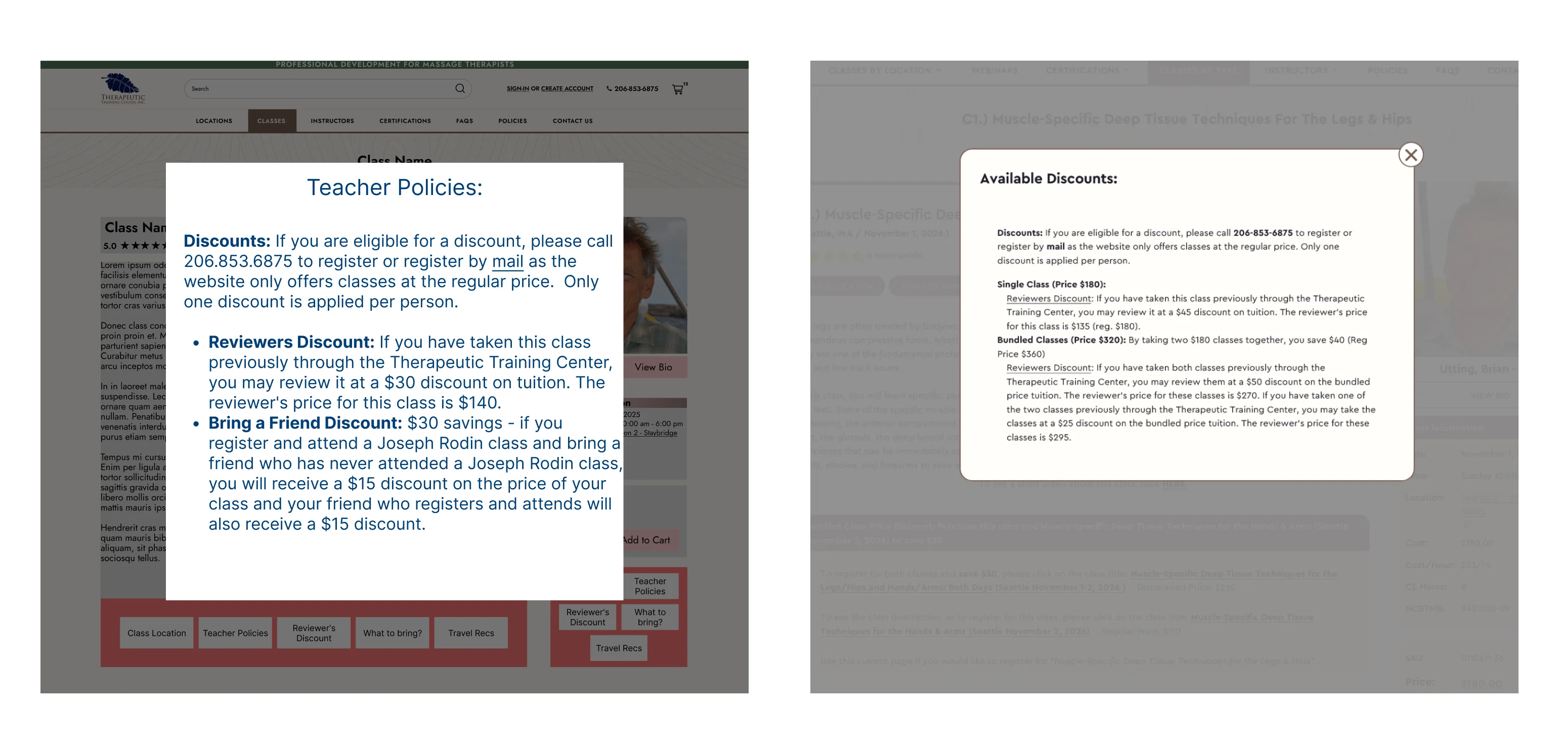
- 4Info buttonsSecondary details, one click away
07 Key Decisions
7AFine print without the clutter.
Every class carries fine print: discounts, location details, what to bring, travel tips. Putting it all on the page would bury the class itself, so secondary details open in pop-ups from a row of info buttons. It made it from my wireframe to the final build almost unchanged.
7BToo spa, not enough Pacific Northwest.
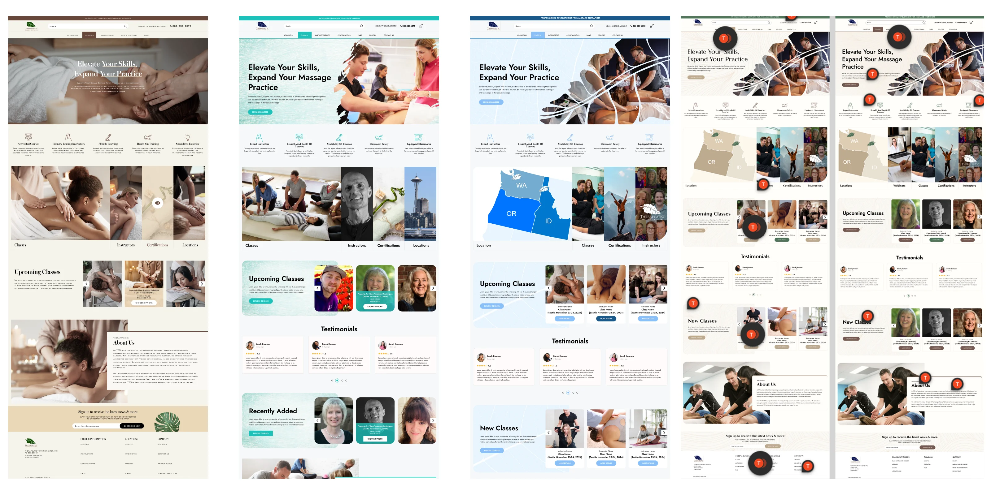
The first concepts felt more like a spa website than a professional training center. We tried different palettes and design elements, from leaf textures to paint brush strokes, across 15+ homepage versions before landing on natural greens, browns, and tans and the topographic line pattern Robbin loved. I ran those review rounds in Figma with Robbin and our designer, with feedback pinned right on the designs.
7CKeep what returning students already know.
Robbin's students were used to her date-ordered class table, and she wanted to keep it. My prototype kept the table, and the final build improved it with month groupings, tags she can customize, and a "Class is full" option (Figure 3.0).
08 Handoff
The system wasn't mine. Making it hers was.
The fix for hours of hand-coding was technical: the agency's lead developer designed and built a system where a class is entered once and appears on every relevant page. My job was making sure it solved Robbin's real problem, and that she could actually use it.
I carried her requirements to the developer, coordinated milestone timelines, and kept Robbin updated throughout. Then I wrote all of the documentation, a step-by-step guide of around 20 pages, and walked her through creating and editing classes on a Zoom training call. A system she couldn't run without calling us would have just traded one dependency for another.
09 Outcome
From hours to minutes.
Class updates went from 2–3 hours of coding to a few minutes of filling in fields. Mobile works again, and organic traffic climbed from near zero back to pre-pandemic levels: 99–176 visitors a month.
Robbin told us her customers praised how much easier it is to find and enroll in classes. Apart from a couple of developer-level fixes, she runs the site herself.

| Before | After | |
|---|---|---|
| Adding a class | Hand-code a page in HTML, then copy the details onto two more pages | Fill in fields once; the class appears on every relevant page |
| Time per class | About 2–3 hours | A few minutes |
| Phone visitors | The desktop site, shrunk to fit (for more than a year) | A working mobile site |
| Organic traffic | Near zero (Nov 2022 – Mar 2024) | 99–176 visitors a month, back to pre-pandemic levels |
| Running the site | Robbin, hand-coding every page | Robbin, filling in fields |
Traffic figures from SEMrush reporting shared with the client.
“Lorem ipsum dolor sit amet, consectetur adipiscing elit. Sed do eiusmod tempor incididunt ut labore et dolore magna aliqua. Ut enim ad minim veniam, quis nostrud exercitation.”
10 Retrospective
What TTC taught me about running a project.
TTC was one of my first projects as lead, and it shaped how I've run projects since. Two lessons stuck.
Design for the person who runs the site, not just the people who visit it. Robbin would use the site more than any student. The documentation and training weren't an afterthought; they're what made the new system hers.
An engaged client needs a clear approval rhythm. Robbin was hands-on and full of input, which is a strength. TTC showed me that a client like that also needs to know exactly when each decision is due. On later projects, including BLVS, I set review windows and approval deadlines at kickoff.